Contrast is one of the eight principles of design – a set of tools you can use to create an intentional piece of art. (The others include pattern, emphasis, proportion, rhythm, harmony, and balance.) You may find evidence of all the principles in your photos, but you probably only consciously include one or two at a time.
Contrast refers not only to the difference between light and dark, but also a contrast of rough/smooth, sharp/blurry, or vibrant/dull. The placement of opposing elements next to each other is used to create interest, show differences, or lead your viewer’s eye to a certain area.
An image with contrast that’s too low has a “flat” appearance, which may work against you when trying to draw attention to a certain area. When everything is the same value, you don’t know where you should look until you see the bear. Which of the images below works better to lead your eye to the bear?


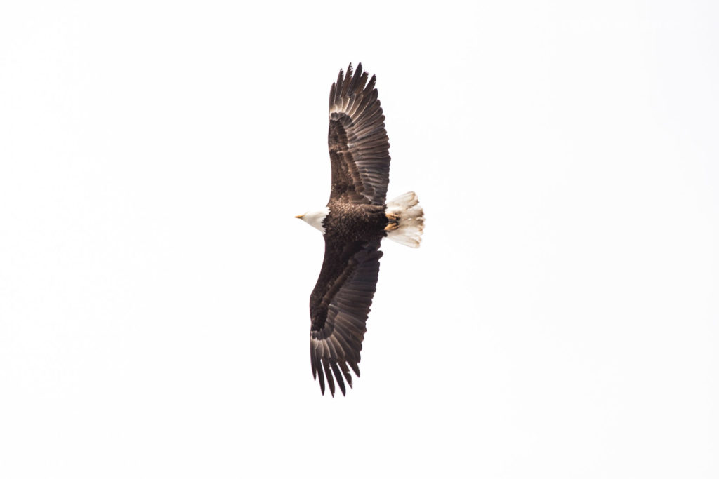
High contrast naturally attracts attention, so a subject that contrasts strongly with its background is more likely to be the first place your viewer will look. A complete lack of distractions in the next image also helps to make a clear subject. Think of it as a contrast between detail and no detail. A white bird on a white background wouldn’t have the same clarity.

The high contrast between black and white in this image leaves no questions as to what the subject is.
I’m not saying is that an image needs more contrast to be better. That’s certainly not true at all. Contrast is simply a principle you will want to keep in mind, using it to your advantage where it makes sense.
Adding more contrast in post-processing can add a more dramatic feel to an image. I can’t tell you which one looks “better” since I can see merits in both of these images, but I personally went with the more contrasty image. A lot of the choices you make will come down to achieving your personal photographic style.
Increasing contrast also has the added effect of boosting saturation.


The amount of contrast your image has is determined first by the lighting in your scene, and then by how much contrast you add or remove in post-processing. Some images are going to be naturally flat, lacking any dramatic contrast. Other images will occupy the full dynamic range of your camera, leading to a very high contrast image (the case in the sunset image above).

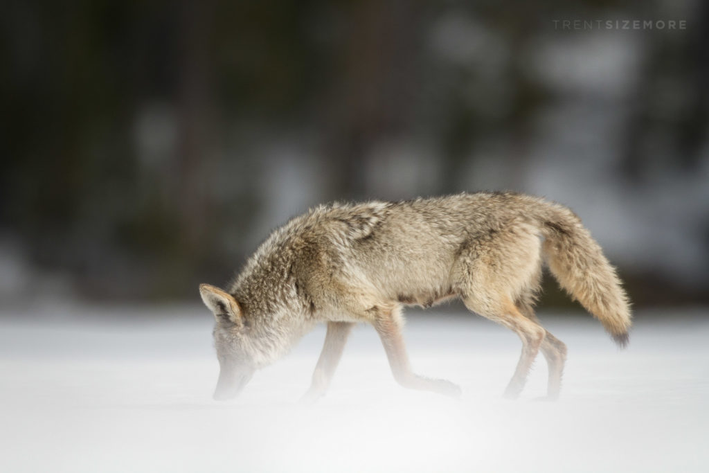
This image has a naturally high contrast straight out of camera because of the bright snow in the foreground and the dark forest in the background.

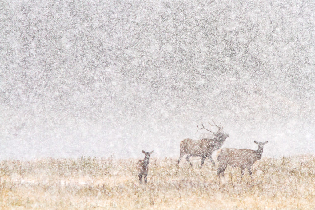
A naturally “flat” image that works. Adding any more contrast in post-processing than this will start looking artificial.
A “high dynamic range” image is one that exceeds the contrast ratio your camera can capture in a single exposure. You can then take multiple exposures to capture the full range of values and combine them, but you are still compressing that extended range into the limited range of your display device can show. To put it into persepctive, most modern cameras can capture 10-12 stops of dynamic range (13+ for full frame) and a good display can show about 10-12 stops as well. A print may only be able to show a single digit number of stops. Most scenes fall well below 12 stops, and don’t require HDR techniques to capture (though people still use them anyways). Examples of scenes that go outside this range (requiring HDR techniques) include interior/exterior shots, and shooting directly into the sun.
The above images have all focused on global, or an overall contrast. There is another type, local contrast, that works on a smaller scale. If you understand the concept that sharpening is applied by increasing contrast only around edges, then you can understand that local contrast lies somewhere between sharpening (edges) and global contrast (overall). Local contrast can be adjusted with the clarity slider in Lightroom. I’ve written a separate full article on global vs. local contrast here.
After reading all this, you might be wondering how to actually use contrast to improve your photography. As I said before, contrast doesn’t make an image better or worse. It’s simply a tool you can utilize to achieve your own style. Do you want dramatic images that range all the way from black to white, or do you want flatter images that have a soft, moody feeling? Start looking for scenes that fit your style, then determine whether you should add or remove contrast in post-processing.
[text-blocks id=”4129″]

