Imagine you’re photographing a bear alongside a dozen other photographers. Everyone is getting essentially the exact same photo, so how is yours going to stand out? Composition.
Not to say that most photographers aren’t taking composition into consideration, but how much have they studied it compared to other “cooler” things like the latest gear and getting tack sharp images without a hint of noise? A boring image that’s perfect technically is still a boring image.
This post couldn’t possibly cover everything related to composition (that would take hours), but it does include a few ways you can get started with creating more successful compositions that help emphasize what you want (your subject).
INCLUDE ONLY WHAT’S NECESSARY
Here’s an image with multiple compositional errors. Notice the distracting branches coming in from the top, bottom, and right side of the frame. None of them have any importance to your subject, so they shouldn’t be included. The other bushes around the bears are part of the environment, and not as distracting.

The second noticeable mistake is framing with one bear at the very edge. Just moving the camera a little more to the right would’ve fixed this. If an animal is looking in one direction, I like to give more “space” on that side of the image. In the case of this image, I would’ve preferred having an equal amount of space between the edge of the frame and each of the outside bears, framing all three centrally.
This next image works much better, with a tighter crop and the bears all together. This composition includes only what is necessary, and the background is sufficiently blurred to clearly isolate the subject.

This image possibly could have been improved by including a foreground. By having both a clear background and foreground in an image, you make a two dimensional image appear more three dimensional.
THE RULE OF THIRDS
Composition is not a set in stone rule you can learn and follow. It’s creative, and therefore has infinite interpretations. Creative composition will naturally become a part of your individual photographic style.
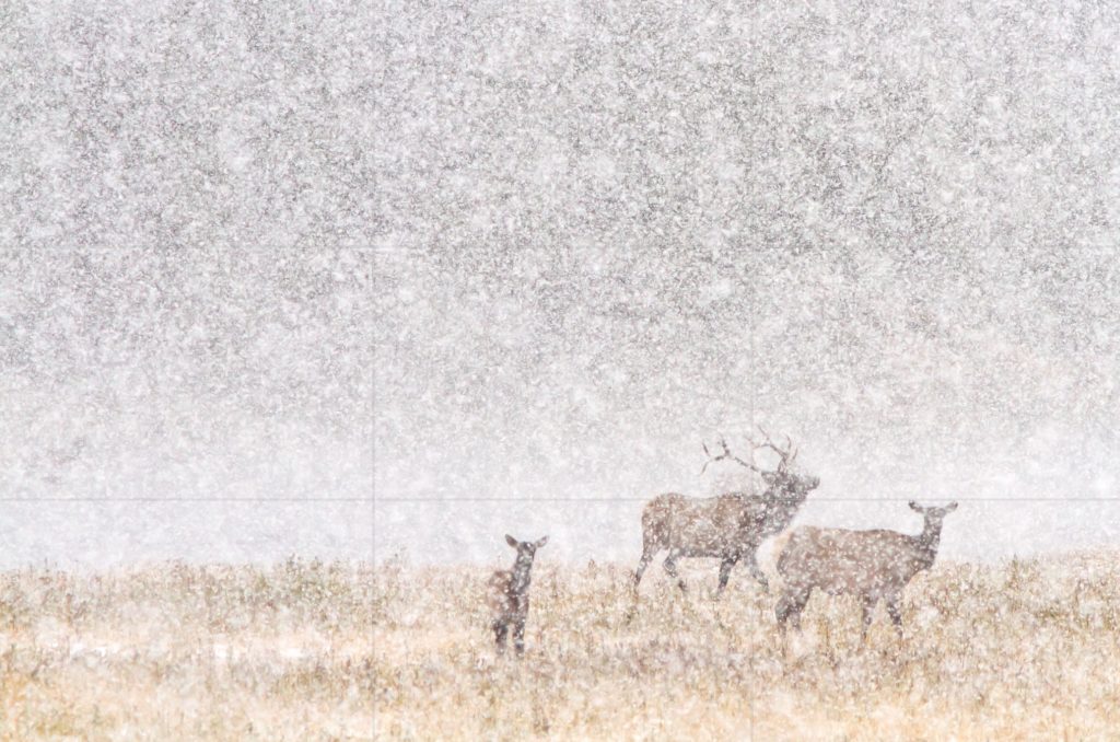
The next image is one that somewhat follows a suggested guide for composition, the rule of thirds (you should know the rules before you can decide to break them). If you have two lines dividing the image into thirds in each direction, the resulting intersections are where the eye naturally looks the most. Placing your subject or a point of interest at these intersections is a good general compositional rule.

This image loosely follows the rule of thirds, but instead of placing the horizon on the bottom one-third line, it’s just slightly below. Two of the lines do cross through the main bull elk here, since that’s part of the main subject. The exact part of the subject you place on the thirds intersection is up to you, and there’s not really a wrong way to do it. You should try multiple crops before deciding the one you like best.
One of the worst things you can do is just place your subject dead center in the frame. It’s uninteresting, and really only works for symmetrical compositions.

Why does moving the subject off center help? In the case of a walking animal, it now has more “space” to walk into. It just feels more natural.

USING SCALE
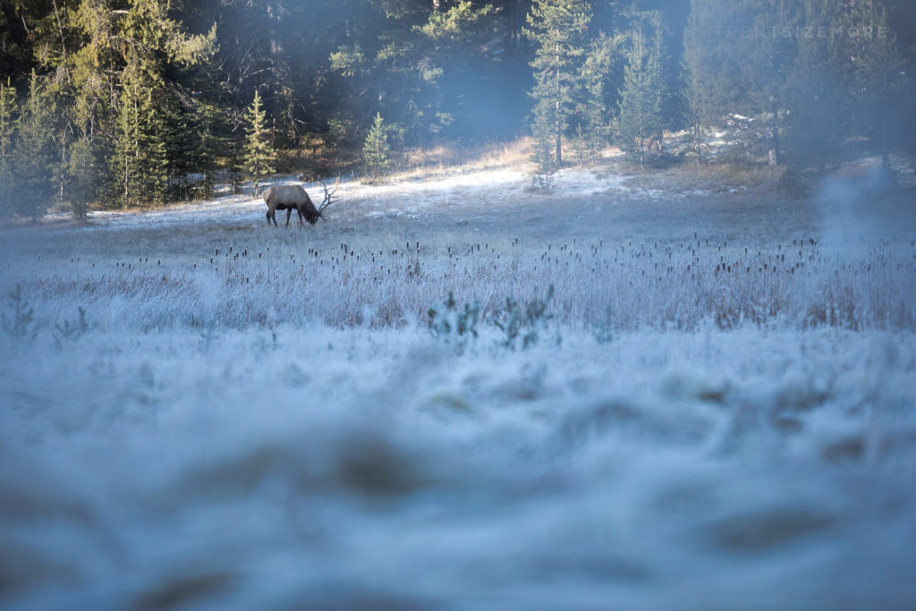
How do you properly portray the true scale of what you’re photographing? Photographing wildlife often involves huge landscapes, and zooming out to show that every once in a while helps create a sense of scale.

Including a foreground is another way to play with scale. Shooting at a low angle (on the ground) creates a foreground that transitions from blurred to sharp as you move towards the focal point (subject). The closeness of the foreground gives it more area in the frame, but knowing the elk is actually bigger helps make your viewer think a little harder about what’s going on in the image.

[text-blocks id=”4129″]

